Fast Food Promo Project for the Digital Typography class at Oakland Community College, Fall 2024. We were required to pick one of a variety of items from different fast food menus and create promotional design for said item. I went with the Taco Bell Nacho Fries, since it’s a product that allows for more creativity in its promos.
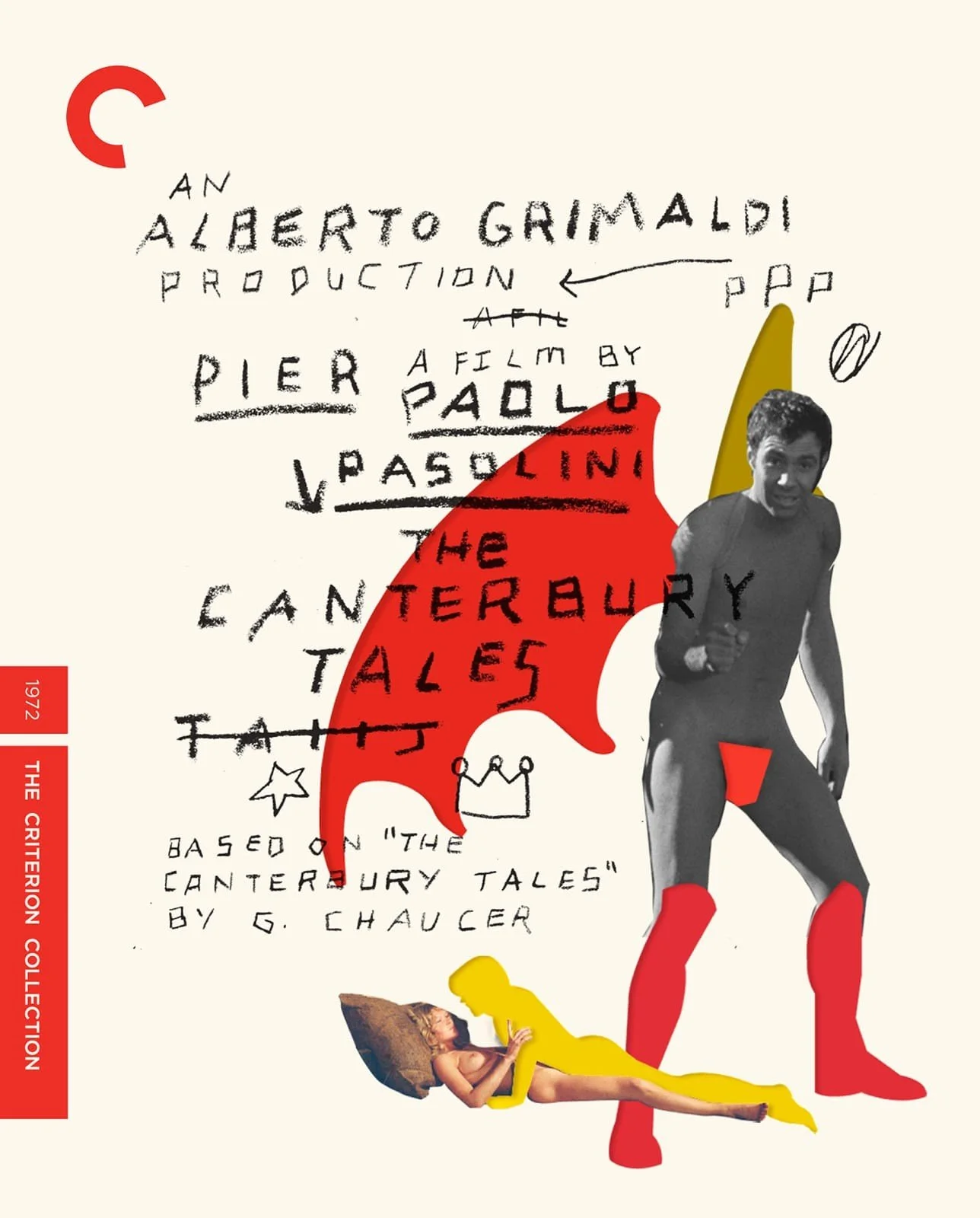
I was inspired by cover designs made for the Criterion Release Blu Ray of Pasolini’s The Decameron (examples at the end of the page). Flat muted background, cut-outs in different colors, simple shapes, and aggressive typo all were elements present in those covers that I wanted to emulate.
Posters and Symbology
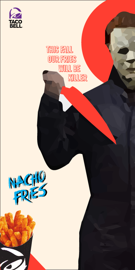
The main art is composed of characters from iconic Slasher movies (sub-genre of horror) grouped together in a collage. Inspired by the colorful cut-outs from the Criterion covers, I made each of the characters’ famous weapons one single, flat color. Michael Myers (the one on top) also has a halo in the color red, which is the same for his weapon. I believe these elements help display the characters as “divine” in a way, for they are figures that represent the horror genre in the zeitgeist.
My approach of horror comes from the Nacho Fries’ flavor being so good it’s “killer” and the release of the promo being during the Fall (Halloween). Having iconic horror characters bring the Nacho Fries back to the menu in this fashion really feels like a pop-culture event. This time they don’t want to kill you, though. Their thrill is in delivering Nacho Fries to customers.

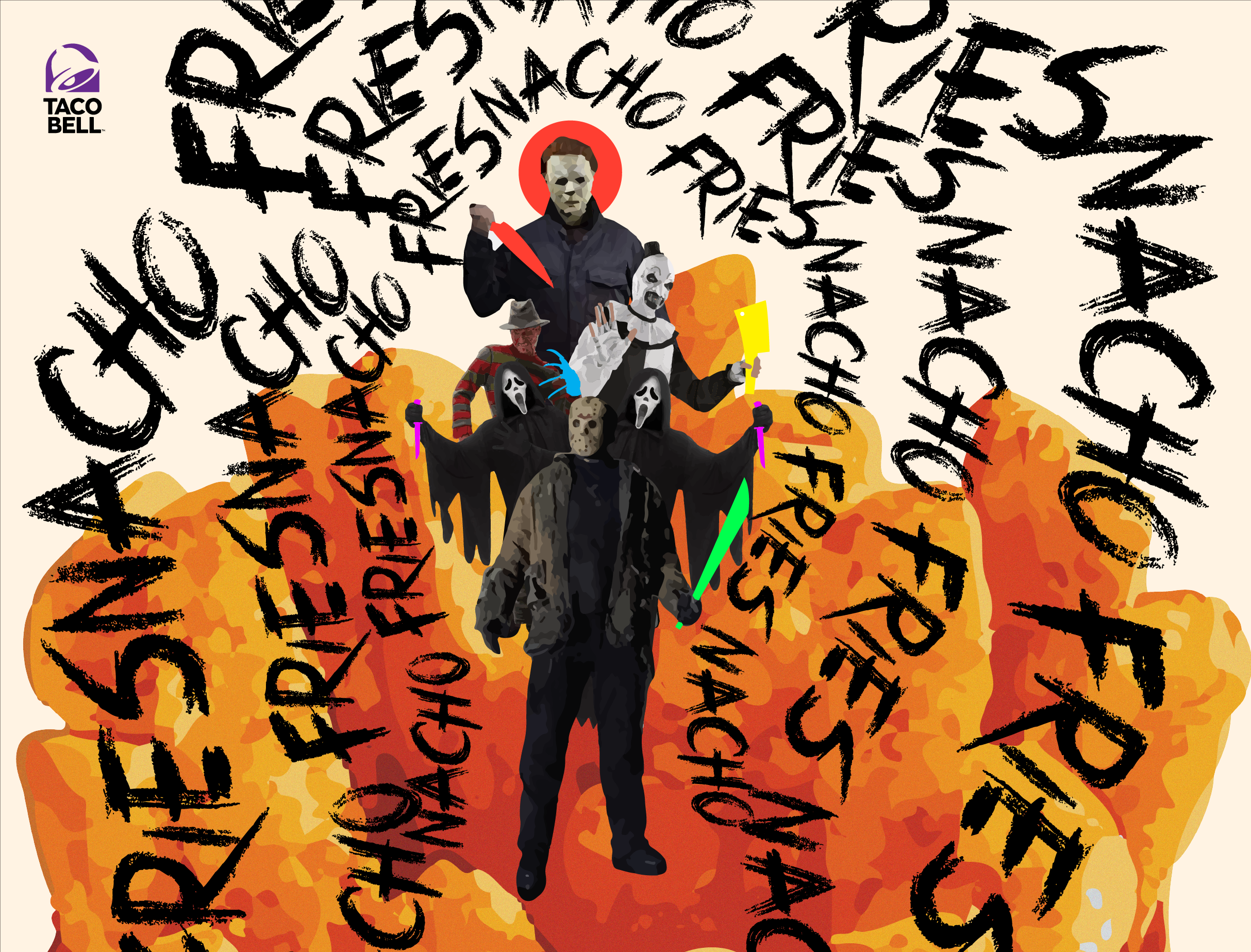
These are print posters that would be used in-store. I picked Freddy and Michael Myers since their poses fit well with the aspect ratio of the design. Here we see the halo once again, as well as the weapons in highlight. In a way, by removing the weapons and placing a flat color on top of them, I am taking away their actual danger. It’s as if the color was a way to imbue new meaning onto them. You don’t see them for what they are, they are a blank canvas for Nacho Fries. The way they interact (violently) with their victims is now given new framing in this promo.
The Halo on their heads represents how their mind, their essence is now also framed differently. These villains are under the power of Fast Food Promo, their minds and weapons are all restrained and given new meaning; which could be anything really, but with all that Nacho Fries around it, it’s easy to see their new interest.
Another poster below, but more horizontal.
The choice of type is supposed to feel like the writings of a mad man that hungers for… Nacho Fries, not killing. This promo is all about taking imagery of violence and turning it onto its head with Nacho Fries.
Below my inspiration for this project: