


Final Project for the Graphic Design Strategies class at Oakland Community College, Winter 2025. Our objective was to create a PSA for a real or made-up organization and develop multiple design pieces pertaining to the campaign.

Ads
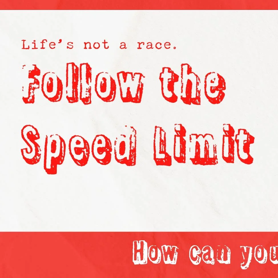
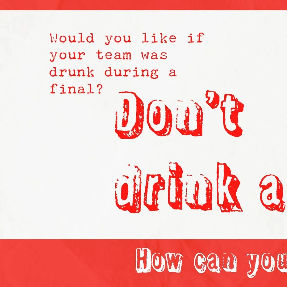
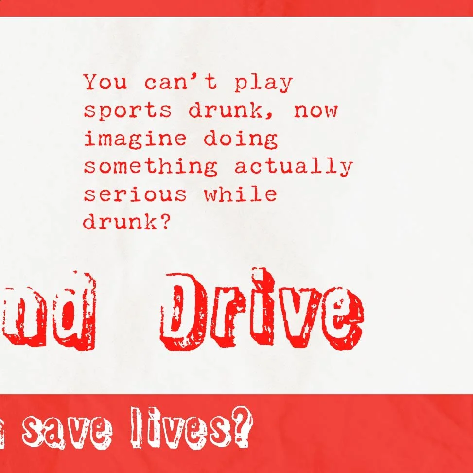
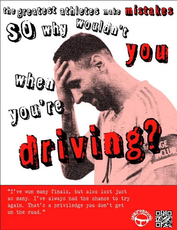
It all started with the Ads, for which I came up with a concept inspired by punk design and a slightly disruptive use of typography. This PSA campaign focuses on reckless driving, targeting sports fans by drawing parallels between sports stakes and real-world consequences. Using Serena Williams, LeBron James, and Lionel Messi, the message emphasizes that while losing in sports has no real danger, losing on the road can be fatal. Fallibility is a key point here— if elite athletes make mistakes, so can drivers.
The choice for sticking to a 2-color palette was to create a bold contrast in the imagery, calling people’s attention to the dramatic tone of the picture, but I was careful to not get too sappy. My intention was to balance the drama with a stylized look akin to Punk Design; or rather a toned-down version of it.

Pocket Folder
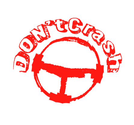
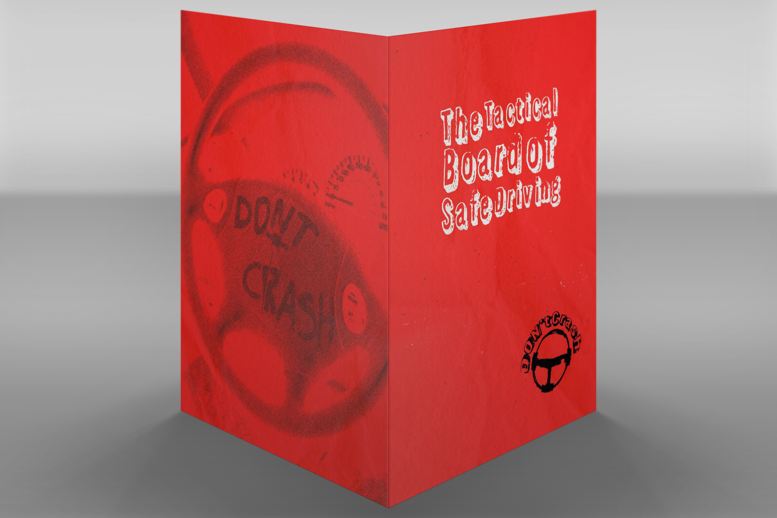
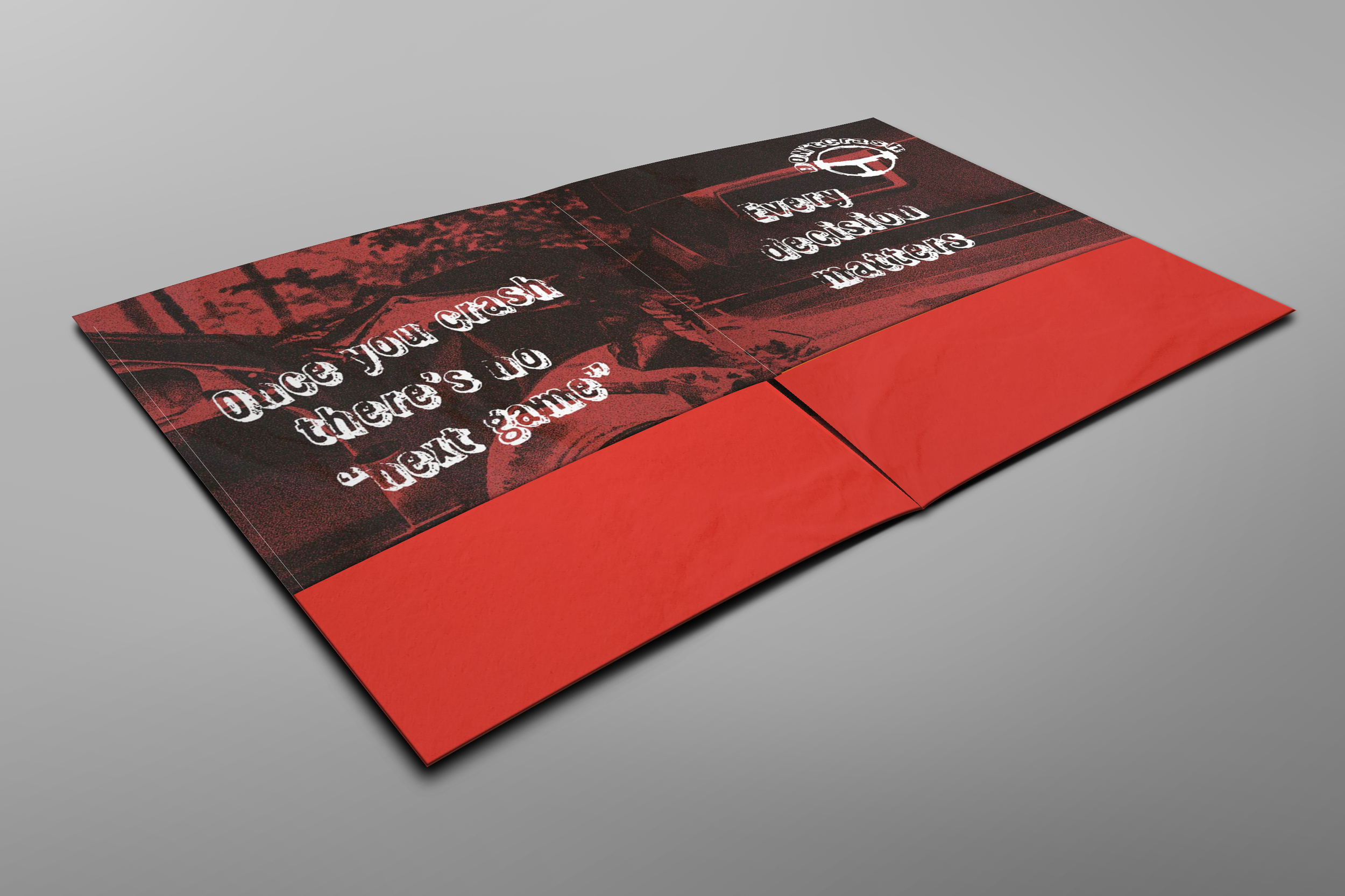
Next was the Pocket Folder that would accompany the Brochure. I kept my type and colors from the Ads, but added the use of photography. On the front cover I took the opportunity of finding a picture with “Don’t Crash” written on a steering wheel, a name that is the same as the fake organization I came up with (logo consisting of a punkish drawing of a steering wheel).
Both the photo mentioned above and the one used in the double spread for the inside were edited with high saturation, a red gradient filter, and a whole lotta noise. I began to learn Punk Design while doing this project, so I used basic techniques from that style to create this feeling of boldness, aggression. My goal with this approach was to convey the feeling of danger to those reading the PSA, while also showcasing a style known for being pleasant to the eye. Bottom line: it’s not too disruptive, but has enough attitude to make its point.
Brochure
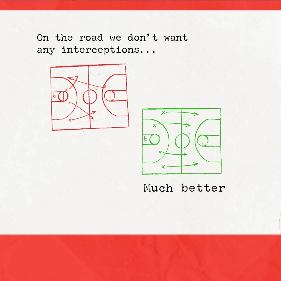
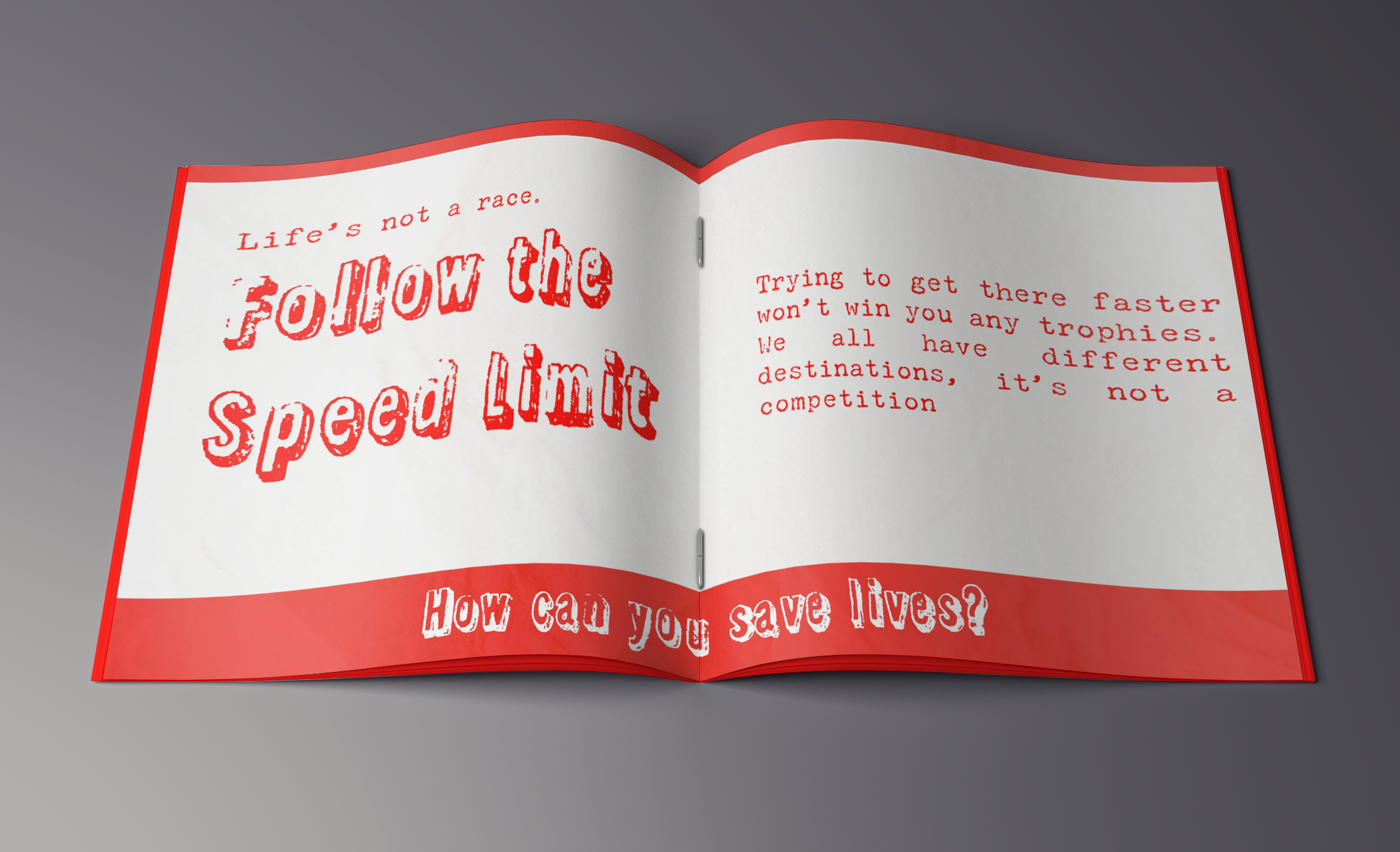
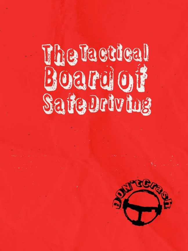
The PSA Brochure can be found in the gallery below, where you can check all the pages in their correct order, plus the front and back covers. We were only required to do 2 pages, but I tried to do something extra. My concept was to connect a sports’ Tactical Board to a moral guide to driving, highlighting key concepts to what it means to drive safe.
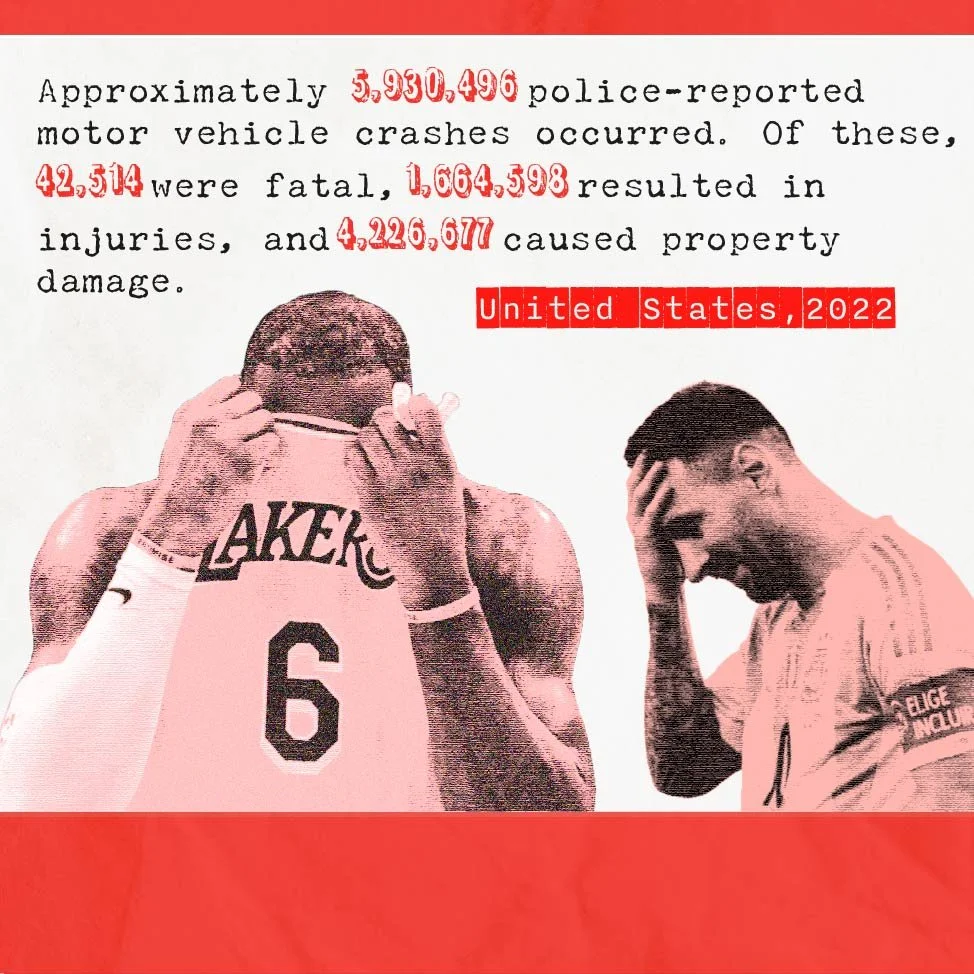
There are parallels to how interceptions on the court are good, but on the road they must be avoided. Then I bring some data on the damage caused by reckless driving. The numbers are designed to contrast with the regular text, keeping the same pattern of colors from the Ads; speaking of them, I chose Serena Williams’ Ad to feature on the following page, since it is the key art from this Campaign.
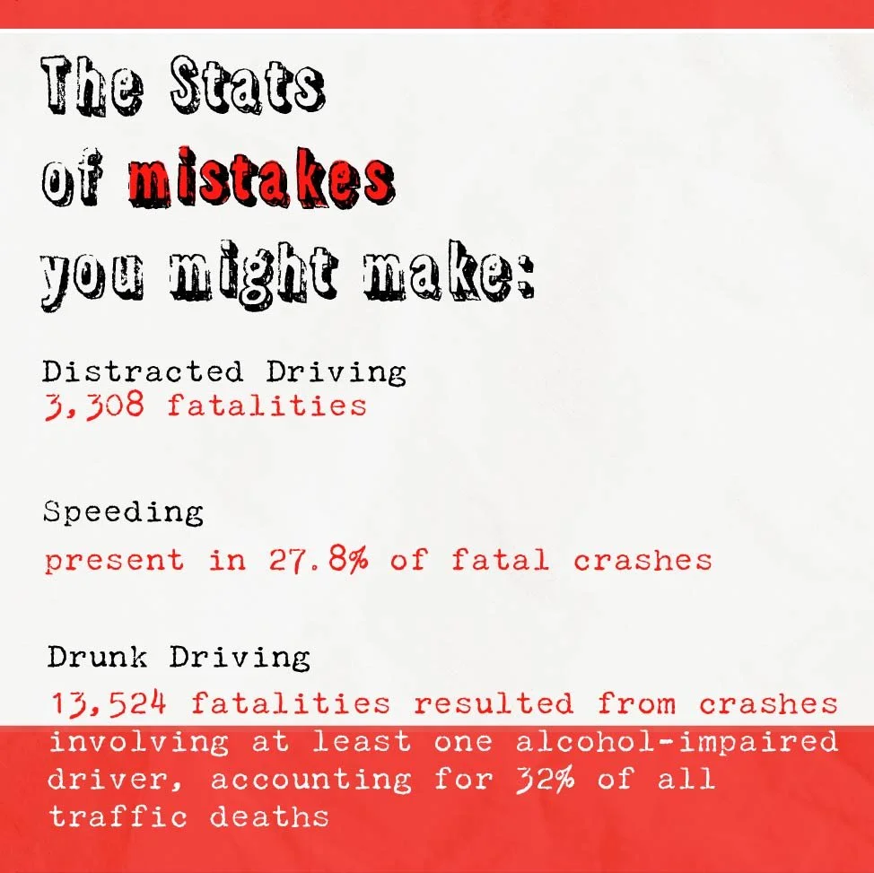
After pointing out the stats (sports lingo) of reckless driving, emphasizing the biggest mistakes committed on the road, I display some of the ways one could avoid them, each message being presented in its own double spread. Next and last, there’s a message to bring the theme home: “Driving is a team effort. You do it with everyone else, not against them”. My target audience is sports fans, the true fanatics for the game (most team sports apply here). I’m also a big fan of sports, so I believe this PSA’s straightforward, concise message would resonate with others like me.
Press Release
We were also asked to make a Press Release for our organizations. For Don’t Crash I attempted to make something following the lines of the pocket folder, using photography and texture.