


Project for the Brand Identity class at Oakland Community College, Fall 2025. We were tasked with creating a Fast Food Brand. I came up with the medieval-infused “Hungry Squire” after doing some research on 14th Century food, and finding out that rissoles were, in a way, the fast food of that time.
Hungry Squire’s objective is to ride the wave of late 90s and early 2000s nostalgia, which has been surging in recent years, and bring back the playfulness and character work to Fast Food chains. Meanwhile, Hungry Squire also has the goal of feeding a target audience of travelers, be it at airports or near highways, regardless of transportation. Healthieringredients are contained inside a moon-shaped hand pie that is th eperfect choice if you’re on the go and need to fully satisfy your hunger.
Target Clients: ● Business professionals and students who travel frequently. ● Late Teens to Late 30s that are into 90s/2000s nostalgia. ● Lower to middle-income range. Budget-conscious consumers ● Enjoys a sense of playfulness in their media consumption ● Consumers looking for different types of Fast Food.
Below is a reference board of my inspirations.
Inspirations

Simpsons’ cartoon style, old time illustrations, Monty Python’s sense of humor, and peculiar coin designs on Pinterest were the key points of inspiration for me. 90s and 2000s nostalgia has been in fashion recently, so I thought it would be interesting to take inspiration from those days, when fast food was very playful and full of quirky characters.
Logo

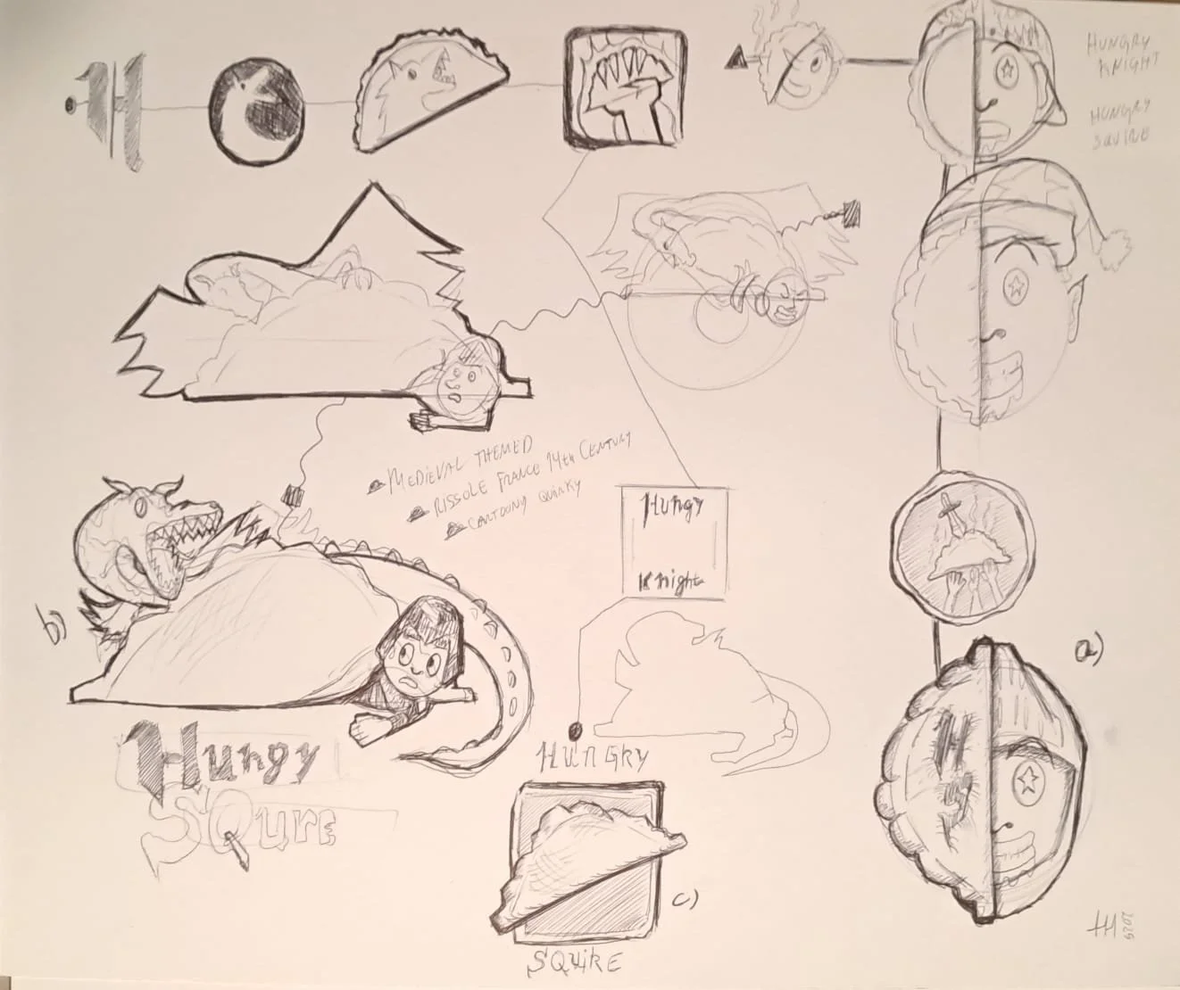
Above you can see both my sketches and final art for the logo. Most of my approach was focused on playfulness and a character-centric design. I settled with the coin-shaped logo because of its simplicity and adaptability. It was also neither too childish, nor too serious.
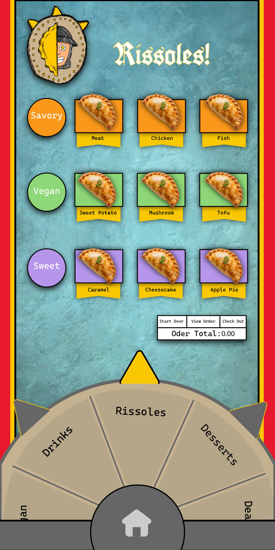
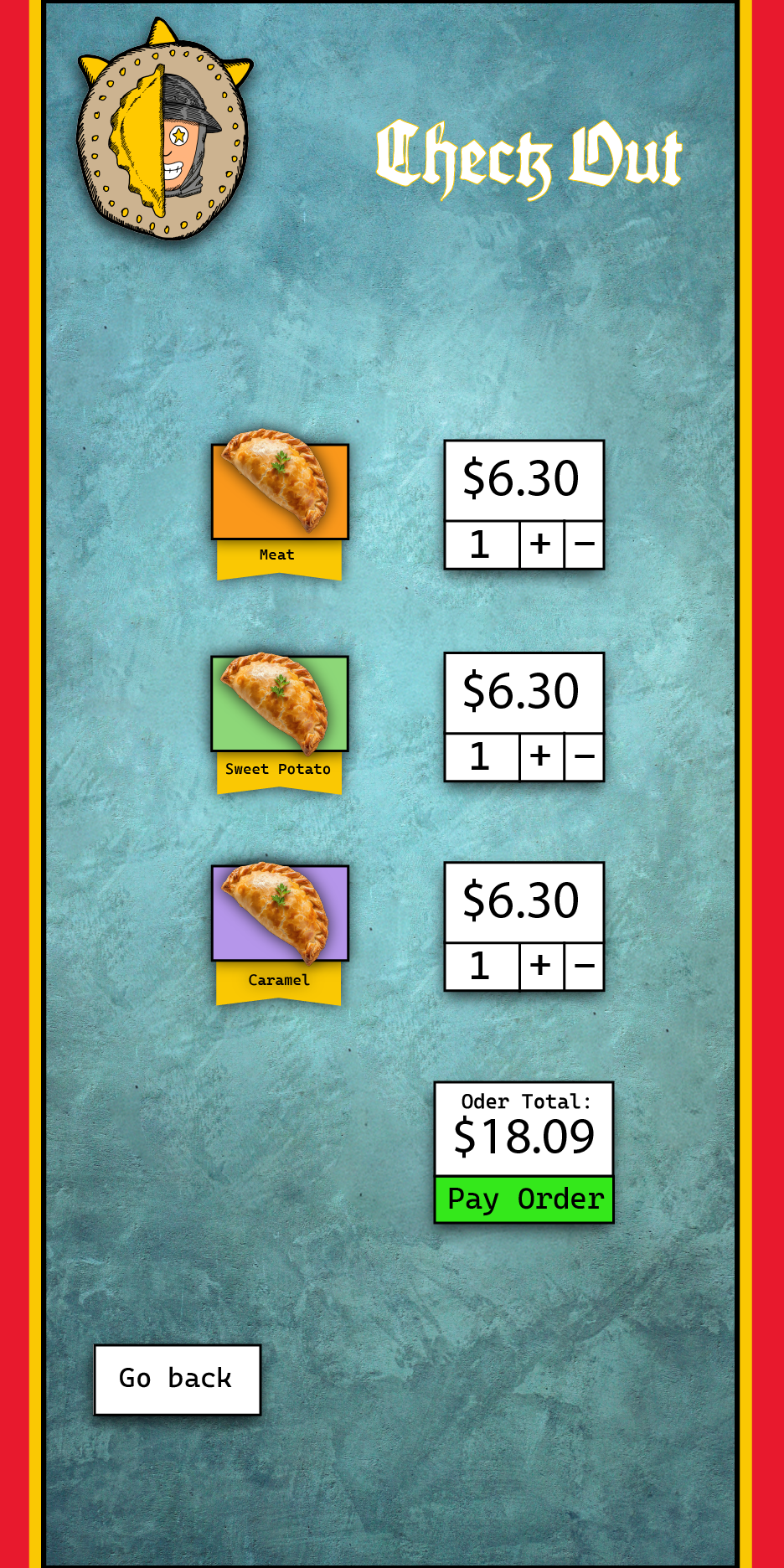
Below is the kiosk design for Hungry Squire.
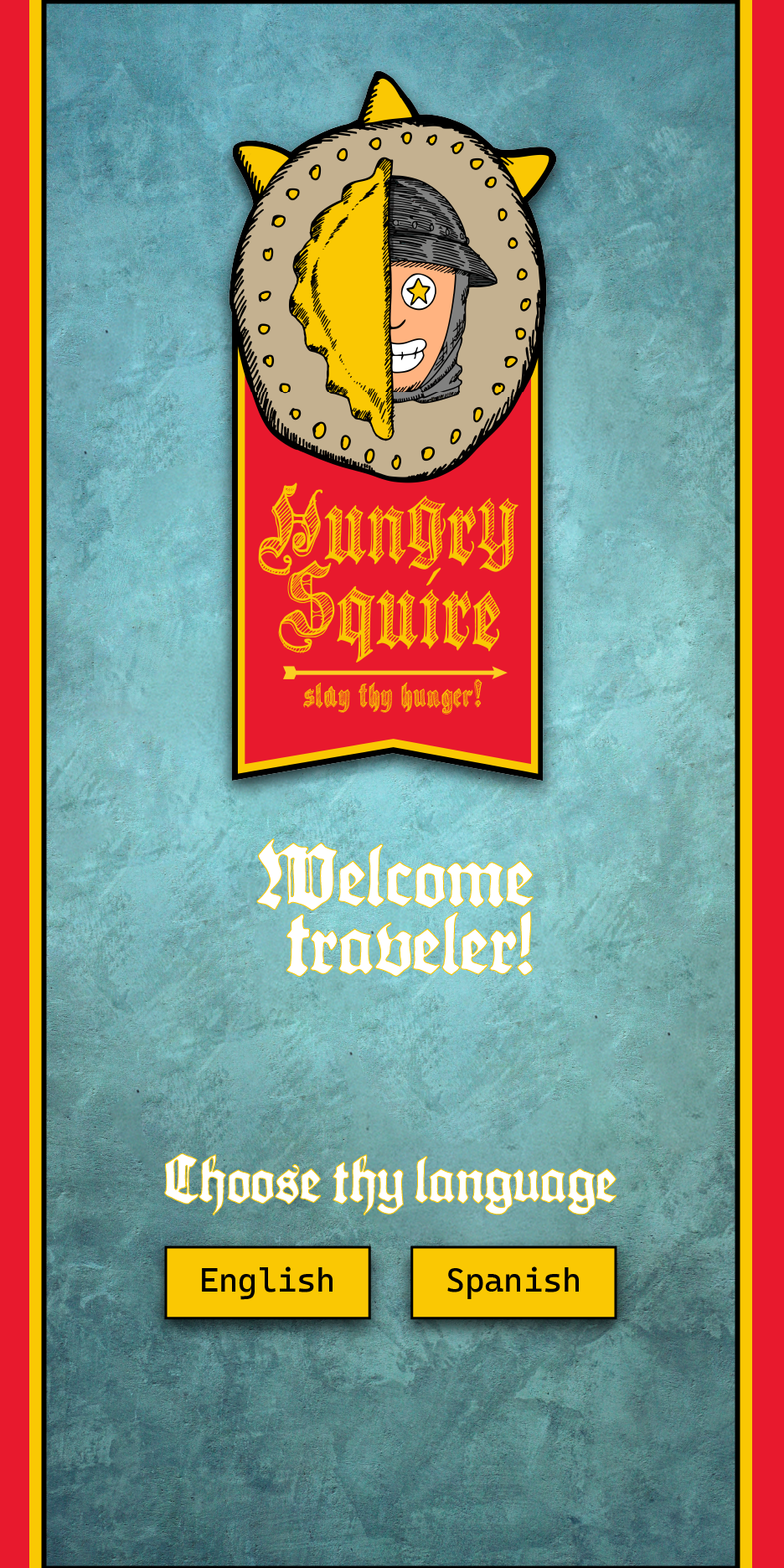
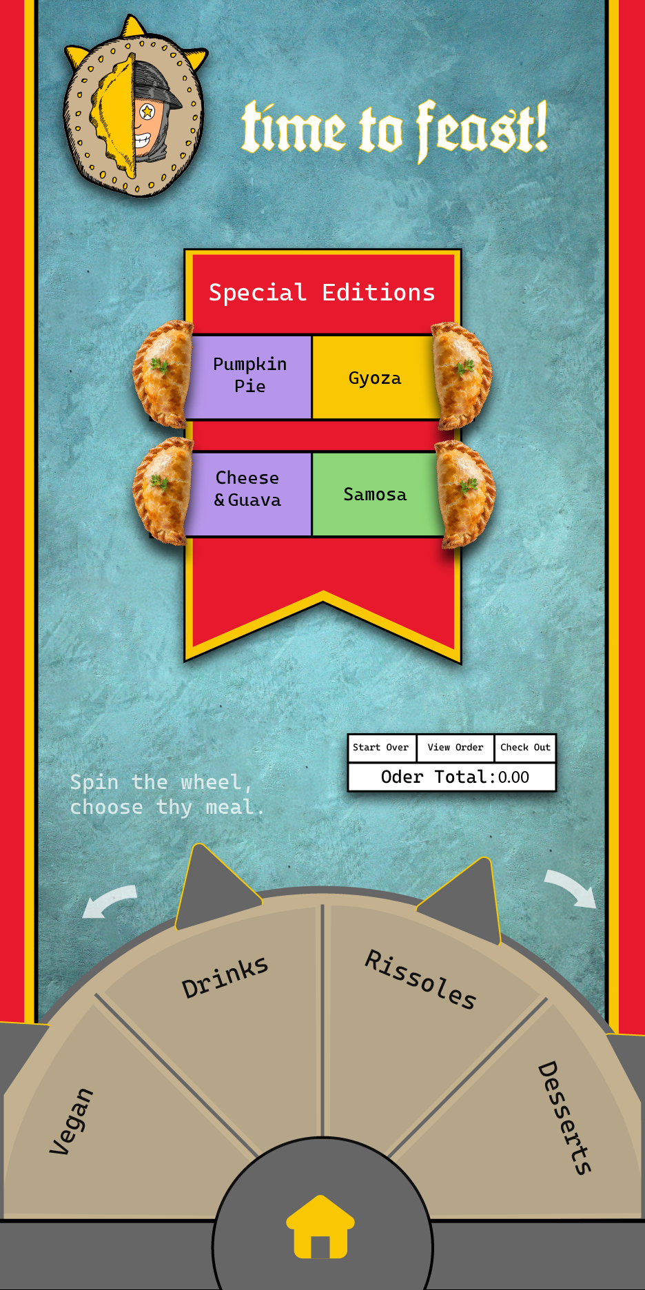
Kiosk

We needed to create 6 pages for the whole process of ordering food, from “Home Page” to “Affirmation Page”. The gimmick that glued this piece together was the “Wheel Menu”. I incorporated the shield from my logo into a spherical menu, with the spikes lighting up whenever you select a page.
I chose this ethereal bluish, foggy background to balance it out well with the stronger colors of the other graphic elements, creating good contrast. As you can see, the Wheel Menu unites the whole piece together and helps the client find their way to the food in a concise, and playful manner.
Check all pages below in larger versions.


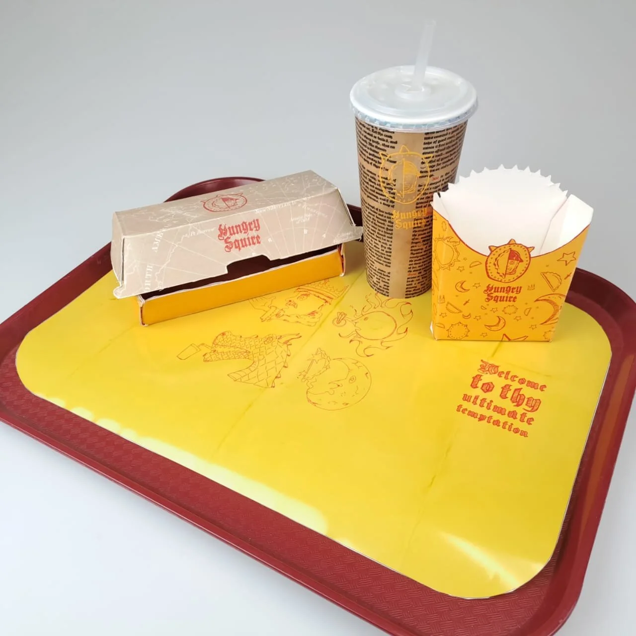
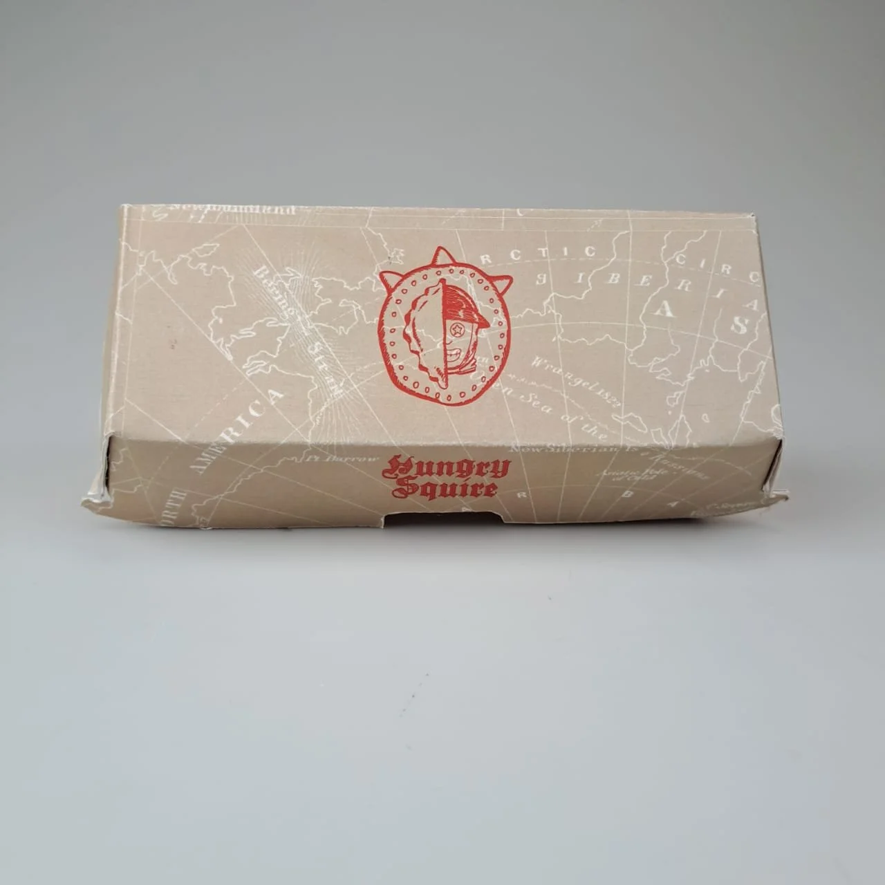
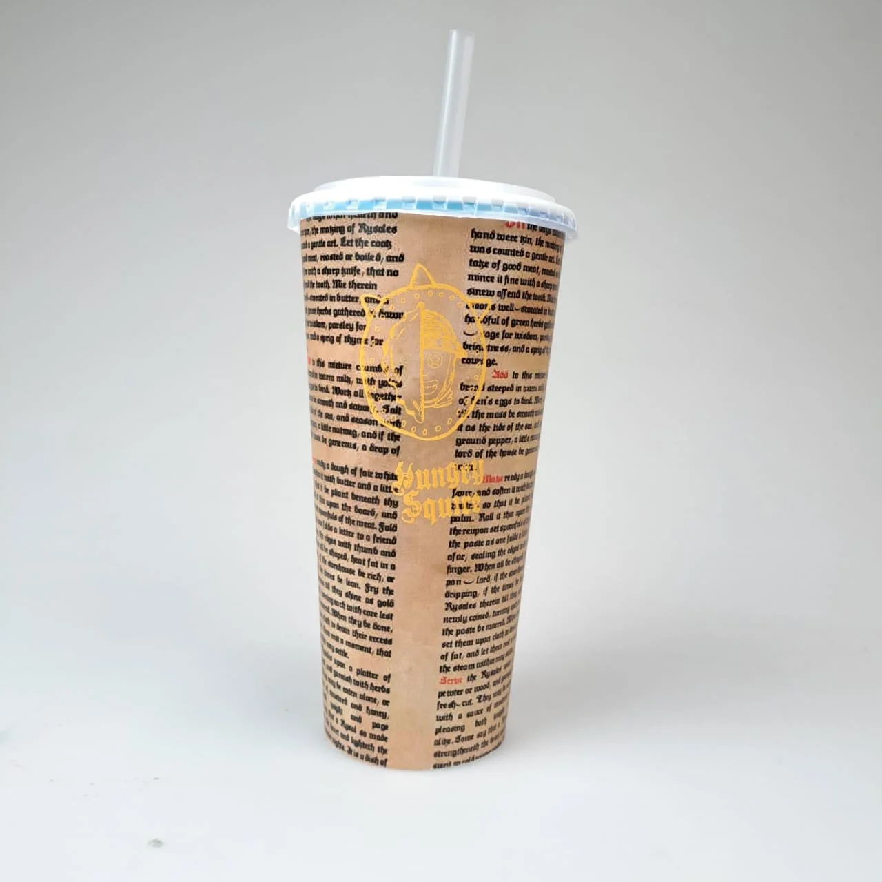
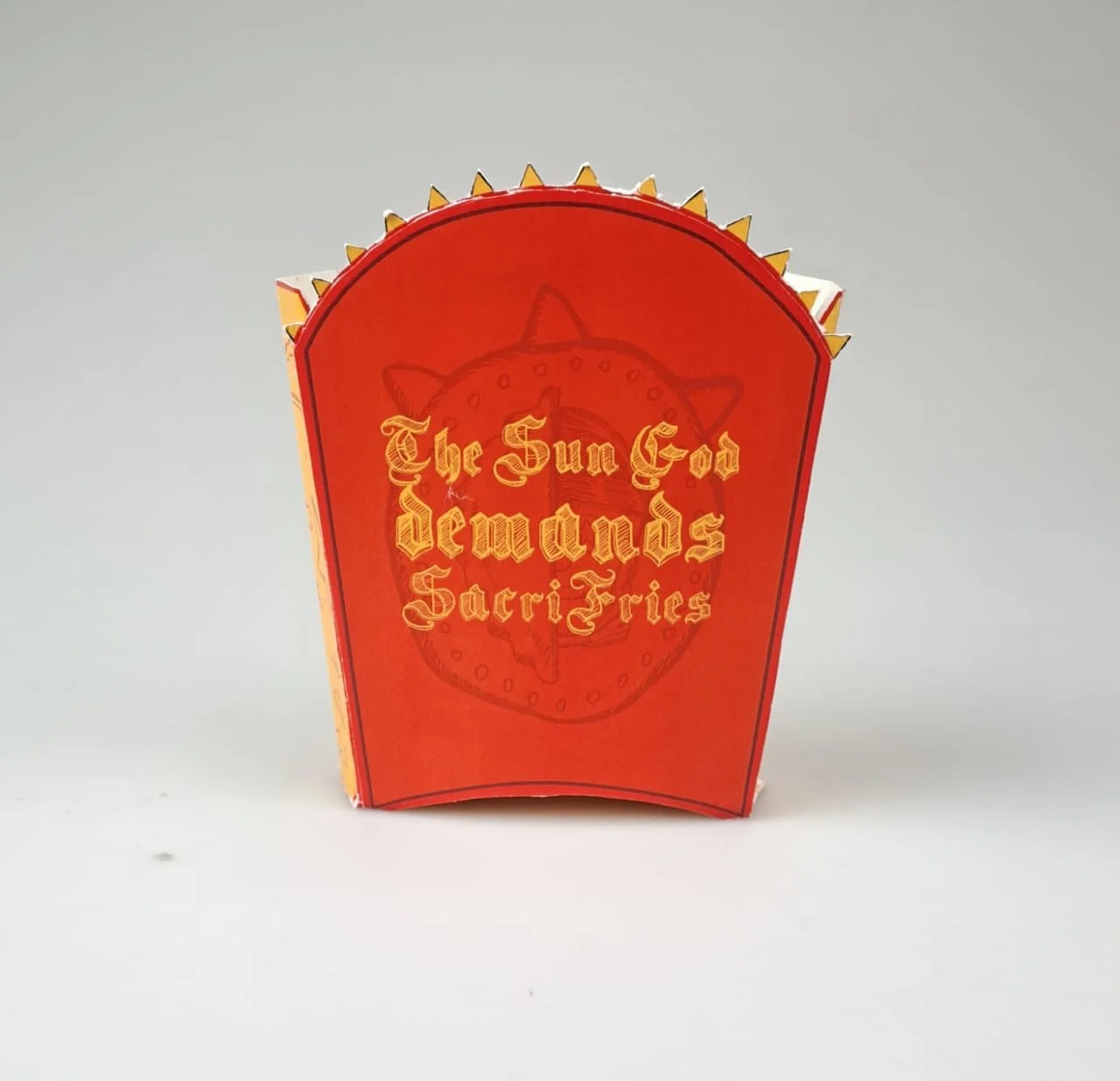
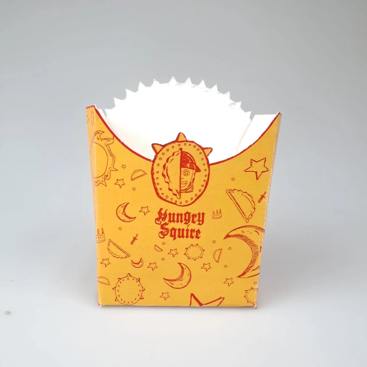
Packaging
For the packaging out goal was to design and build 3 types: Fries Box, Main Item Box, and Cup (plus a tray liner). My “Sacrifries” is surely my favorite of the bunch.
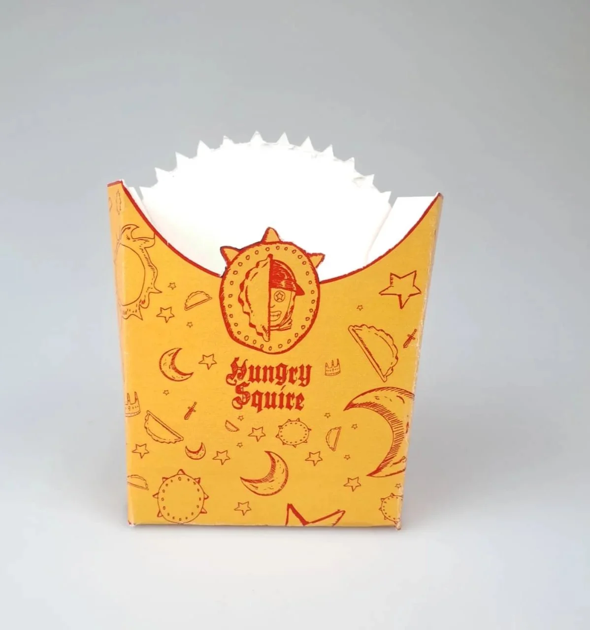
I drew these icons using my iPad and then vectorized them on Illustrator; same thing was done for the tray liner. I kept my dominant yellow on the front and sides, but on the back I went for the quirky slogan: “The Sun God Demands Sacrifries”. Using this pun and name, I managed to infuse these fries with much personality, a trait that was crucial for the project to come to life. Also, adding a familiar fast food item was essential, since rissoles are very uncommon.
The cup has an old book page design. I had to create my own pages since I couldn’t find any existing image that fit what I was going for. The Rissole box takes advantage of the fact Hungry Squire is aimed towards on-the-go students and workers, who during their “travels” must feed on tasty Rissoles to continue their journeys. For that reason, a map design fit perfectly.

Doubling down on character work, the tray liner shows new characters besides the Squire. The starry eyes motif continues, as if they’re all hypnotized by Hungry Squire’s products. The old paper texture and raw drawings help convey this unpolished, more archaic look. The characters are drawn inspired by the flat, 2D look of hieroglyphs.