


Charging Forward
Project for the Graphic Design Strategies class at Oakland Community College, Winter 2025. We were divided into groups to develop a campaign for a public utility service. My original group ended up having too many people, so I decided to move to a smaller team since I wanted to have more responsibility in the project.
I entered the new team after the initial steps were already taken, so my objective was to understand my team mates vision for the project and contribute the best I could following their strategy.
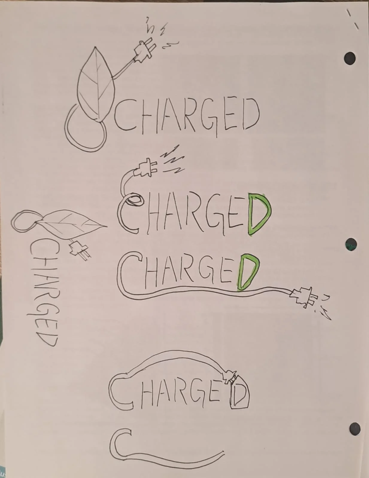
Logo
The logo originally had the plug and cord straight in 90 degrees. I suggested we gave it more movement by making the cord more diagonal in its direction, creating more visual interest.
“The Charging Forward campaign highlights DTE’s leadership in clean energy, showcasing its commitment to wind, solar, and energy efficiency solutions. Through strategic messaging and community engagement, we aim to position DTE as a driving force for a sustainable future.”
Online Advertising
For these Online Ads we were given freedom to each do their own approach.
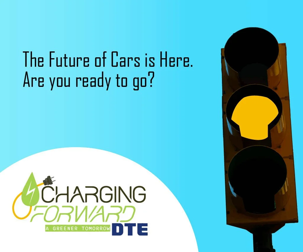
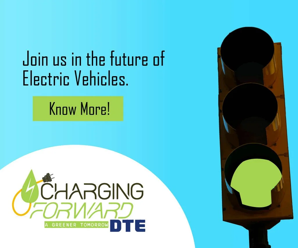
Both images above are intended to be animated, so the yellow light comes up first and it’s followed by the green light, while the text also changes from the Call to Action to the main slogan “Join us in the future of electric Vehicles”.
I also made another set of Ads, but now in different shape and with more steps.
The concept is the same as the first Ad, but there’s a little more drama (“it’s time we stop”) build up (“and think about our future”). For this Ad, the animation would be displayed as if a camera was filming the traffic light from top to bottom, which lends itself well with the ratio of this more flat, horizontal Ad.
The slight color gradient of blue and white is supposed to make the background a little more interesting, while the overall simple color palette has the goal of creating a clean visual.
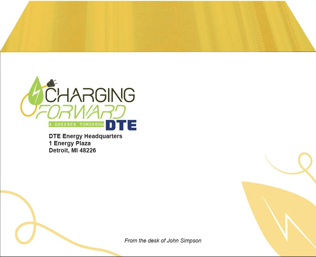
Stationary
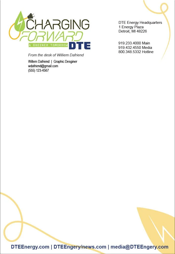
For the stationary we tried setting a theme to the different types. It’s simple, but giving each of them different colors while keeping the same graphics works well in associating them with their own functions.
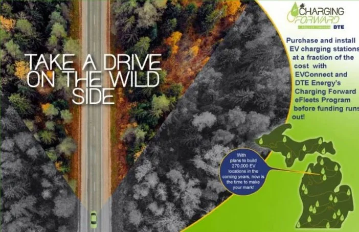
Print Advertising
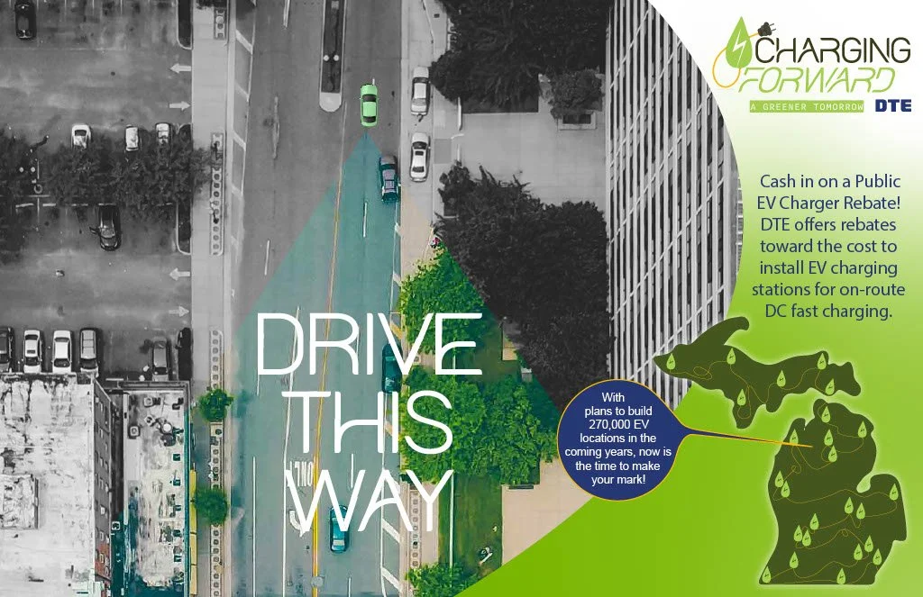
For the Print Ad we came up with a Black & White aesthetic. Each of our Ads shows an Electric Vehicle driving in a different location and spreading clean energy. On its trail we see the location in color, indicating that this car is creating a path for a brighter future. Also, each of us had a different slogan to go with our locations, as to not let the Ads be too stale. Same goes for the information on the green-white boarder; all different pieces of text from the DTE site.


